Why every car site feels the same (and what we did about it)
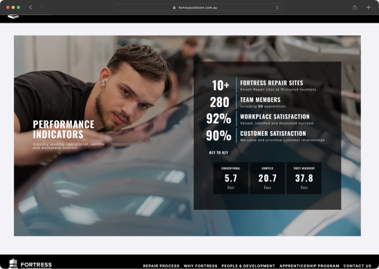
When Fortress approached us, their prompt was clear: the website felt old. It was hard to navigate, inconsistent across pages, and lacked any real identity. They wanted a refresh—not just visually but holistically.
Breaking it down
Auditing their site uncovered broken links, disjointed layouts, and several sub-sites that didn't look like they belonged to the same company. This is what we were initially introduced to work on.
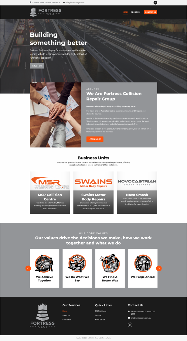
Auditing their site uncovered broken links, disjointed layouts, and several sub-sites that didn't look like they belonged to the same company.
Through stakeholder interviews, we learned the real focus was on promoting apprenticeships and locations. They wanted users to find this information quickly and clearly.
We overhauled the site structure, creating a new sitemap that simplified navigation and unified the experience across pages.
Navigating challenges
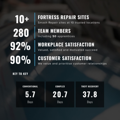
The Fortress team wanted to feel modern, but their feedback leaned heavily on outdated design choices. We worked on visual directions that balanced their preferences with contemporary trends.
The site had grown into a patchwork quilt of mismatched pages. We streamlined it into a single, cohesive experience that felt intuitive for users.
“I want us to feel modern, but I’m not sure going the opposite direction of our competition is the best thing to do.”
With a tight budget and high expectations, we had to be strategic about our iterations. Scope expanded when the first Webflow designs didn't hit the mark, which meant extra rounds of collaboration.
What we changed
Unified navigation so users could easily explore apprenticeships and locations
Designed a cohesive visual identity that felt modern yet approachable
Prototyped 9 key pages with a focus on clarity and usability, so the core user journeys were seamless
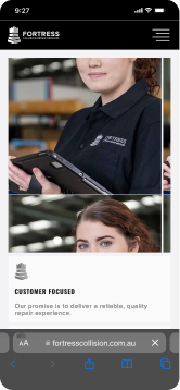
A new look and feel
The final site brings Fortress's brand into the 21st century, simplifies navigation so users can find what they need, and gives Fortress a strong foundation for future growth, both digitally and as a brand.
Apprenticeships
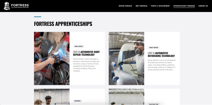
Apprenticeships were one of the client's two priorities, so they got their own page of clear cards that put the course details up front.
News with a face
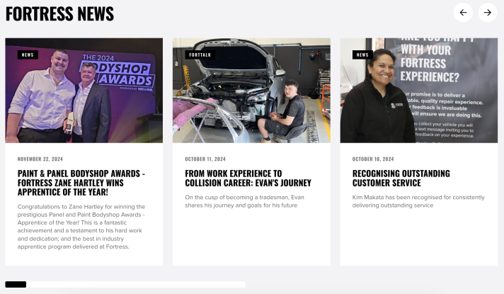
The news page uses a carousel of large photographs and short headlines, so stories about people and awards get the attention they deserve.
Getting each question to the right place
The contact page has tabs for customer, HR and account queries, so people choose their topic before they fill in the form.
